Forró da Capita Graphics

For our snug dance venue in the Prinzenallee 58, Berlin I've built a website with Astro. With it came a logo and a mascot created using the free and open-source vector editor Inkscape .

I'll shortly walk you through the design process of the logo and mascot which you can also see on the Forró Da Capita website

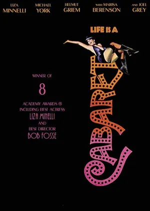
I stole the inspiration for the letters from the cover design of the wonderful Bob Fosse movie Cabaret and constructed the missing letters from the 6 1/2 available ones.

The final logo has to be exported as a plain SVG. The SVG code is cluttered with metadata, and unnecessary precision that can be removed with a SVG minifier.

I liked the Devina SVG minifier best. Check what you can remove without breaking your SVG. I didn't merge path because I wanted each letter to be seperate. The minifier shows you the bytes saved and the visual difference between the original and the minified SVG.

The final SVG path are equipped with some selected attributes to add color, a css glow, and a stroke. The stroke is transparent and pretty fat, to apply the glow on hover and not miss the mouse.

cabaret
clutterd SVG code
<?xml version="1.0" encoding="UTF-8" standalone="no"?>
  <!-- Created with Inkscape (http://www.inkscape.org/) --> <svg width="303.98163mm" height="197.50055mm" viewBox="0 0 303.98163 197.50055" version="1.1" id="svg1" xmlns="http://www.w3.org/2000/svg" xmlns:svg="http://www.w3.org/2000/svg"> <defs id="defs1" /> <g id="layer1" transform="translate(65.61667,-17.72708)"> <path id="path2-4" style="fill:#000000" d="m -14.875581,105.23233 c -19.062561,0.11868 ...
  
minified SVG code
<svg viewBox="0 0 304 197.5"> <path d="M50.7 87.5c-19 .2-39.6 ... 
final SVG path
<path id="F" 
  class="purple_glow fill-[#7f40e5]" 
  stroke="transparent" 
  stroke-width="20" 
  d="M-34 32.9a77 77 0 0 1-26.3 ... 
CSS glow

<style>
path {
transition:
  filter 0.5s ease,
  fill 0.5s ease;
}

/* Orange glow effect */
.yellow_glow:hover {
filter: drop-shadow(0 0 2px #ffa500) drop-shadow(0 0 5px #ffa500) drop-shadow(0 0 10px #fdc85f);
fill: #fff6a9;
}

.green_glow:hover {
filter: drop-shadow(0 0 2px #109c15) drop-shadow(0 0 5px #27aa39) drop-shadow(0 0 10px #0ba708);
fill: #aff2bb;
}

.darkorange_glow:hover {
filter: drop-shadow(0 0 2px #ff9f00) drop-shadow(0 0 5px #ff8c00) drop-shadow(0 0 20px #fd5800);
fill: #fff6a9;
}

.blue_glow:hover {
filter: drop-shadow(0 0 2px #5852ff) drop-shadow(0 0 5px #0037ff) drop-shadow(0 0 10px #497cf2);
fill: #d3d9ff;
}

.navy_glow:hover {
filter: drop-shadow(0 0 2px #000080) drop-shadow(0 0 5px #0000cd) drop-shadow(0 0 10px #002395);
fill: #caf3f8;
}

.red_glow:hover {
filter: drop-shadow(0 0 5px #ff5252) drop-shadow(0 0 15px #ff0000) drop-shadow(0 0 20px #c5400b);
fill: #ffc7c7;
}

.pink_glow:hover {
filter: drop-shadow(0 0 2px #ff52f3) drop-shadow(0 0 5px #ff00d4) drop-shadow(0 0 10px #c50baf);
fill: #ffc7fa;
}

.violet_glow:hover {
filter: drop-shadow(0 0 2px #d752ff) drop-shadow(0 0 5px #bb00ff) drop-shadow(0 0 10px #840bc5);
fill: #f3c7ff;
}

.lightblue_glow:hover {
filter: drop-shadow(0 0 2px #52ffeb) drop-shadow(0 0 5px #00fff7) drop-shadow(0 0 10px #08dee6);
fill: #c7fdff;
}

.darkred_glow:hover {
filter: drop-shadow(0 0 2px #cf1020) drop-shadow(0 0 5px #be0032) drop-shadow(0 0 10px #af002a);
fill: #fcbdcf;
}

.gold_glow:hover {
filter: drop-shadow(0 0 2px #ffd700) drop-shadow(0 0 5px #fcc200) drop-shadow(0 0 10px #ffcc00);
fill: #f7ef79;
}

.lime_glow:hover {
filter: drop-shadow(0 0 2px #86c626) drop-shadow(0 0 5px #7fff00) drop-shadow(0 0 10px #7cfc00);
fill: #e4fe20;
}

.purple_glow:hover {
filter: drop-shadow(0 0 2px #966fd6) drop-shadow(0 0 5px #bf00ff) drop-shadow(0 0 10px #b19cd9);
fill: #e6e6fa;
}
</style>
    
Icons

I wanted custom icons that have something in common, which turned out to be the accent color and little movement on hover. I've drawn them with Inkscape. They look a lot like the usual suspects, found for example at Iconify , but tailored to my needs.

For example the google map icon is a combination different icons, where the upper part hops a little and the lower part turns into the accent color on hover. As long as you keep the paths of the SVG separate you can apply different effects to each path.

In the SVG code below you'll find a shake-vertical class which moves the upper pin of the map icon and and another path that has the tailwind CSS classes group-hover:fill-accent transition-colors duration-900 origin-center applied which turns the map red. I used tailwind CSS here but you can always use normal CSS.

Map Icon Code
  
<a href="https://maps.app.goo.gl/QPQKKK7im9AfE2rz8" target="_blank">
<svg
  xmlns="http://www.w3.org/2000/svg"
  xml:space="preserve"
  viewBox="0 -2 23 40"
  transform="translate(0 -5)"
>
<g class="shake-vertical">
<path
  fill="#34a853"
  d="M7.258 17.202a23 23 0 0 1 1.83 2.698c.466.885.66 1.484 1.002 2.55.209.59.398.765.804.765.443 0 .644-.299.799-.761.322-1.007.575-1.775.974-2.501.783-1.402 1.756-2.647 2.712-3.844.259-.34 1.932-2.313 2.685-3.87 0 0 .926-1.71.926-4.1 0-2.234-.913-3.784-.913-3.784l-2.629.704-1.596 4.204-.395.58-.079.105-.105.132-.184.21-.264.263-1.421 1.158-3.555 2.052z" >
  </path>
  
  <path
  fill="#fbbc04"
  d="M3.59 11.952c.867 1.98 2.54 3.722 3.672 5.251l6.01-7.12s-.846 1.107-2.382 1.107A3.08 3.08 0 0 1 7.796 8.1c0-1.18.711-1.993.711-1.993l-4.08 1.094z" >
  </path>

  <path
  fill="#4285f4"
  d="M13.34.366c1.997.643 3.705 1.995 4.739 3.987l-4.804 5.725s.71-.826.71-2c0-1.763-1.484-3.08-3.088-3.08-1.516 0-2.387 1.105-2.387 1.105V2.497z" >
  </path>

  <path
  fill="#1a73e8"
  d="M4.691 2.895C5.883 1.468 7.981 0 10.874 0c1.404 0 2.461.369 2.461.369l-4.83 5.738H5.083Z" >
  </path>

  <path
    fill="#ea4335"
    d="M3.59 11.952s-.798-1.563-.798-3.827c0-2.14.832-4.01 1.899-5.23l3.817 3.212z">
  </path>
</g>
  <path
    fill="currentColor"
    class="group-hover:fill-accent transition-colors duration-900 origin-center"
    d="m16.639 21.31-1.02 1.918 4.993-.816c-1.008-.505-2.372-.867-3.973-1.101m-12.862.418C1.465 22.339 0 23.338 0 24.822a2.2 2.2 0 0 0 .205.925l8.013-1.31zm18.525 2.228L11.15 25.774l2.94 3.346c4.83-.432 8.4-1.975 8.4-4.298 0-.31-.067-.597-.188-.865M9.265 26.088 1.73 27.32c1.992 1.233 5.507 1.928 9.515 1.928.243 0 .48-.007.72-.012z" > 
  </path>
  </svg>
</a>

<style>
  @keyframes shake-vertical {
    0%,
    100% {
      transform: translateY(0);
    }
    10%,
    30%,
    50%,
    70% {
      transform: translateY(-1.5px);
    }
    20%,
    40%,
    60% {
      transform: translateY(1.5px);
    }
    80% {
      transform: translateY(1px);
    }
    90% {
      transform: translateY(-1px);
    }
  }

  .group:hover .shake-vertical {
    animation: shake-vertical 5s ease-in-out 0s infinite normal none;
  }
Mascot

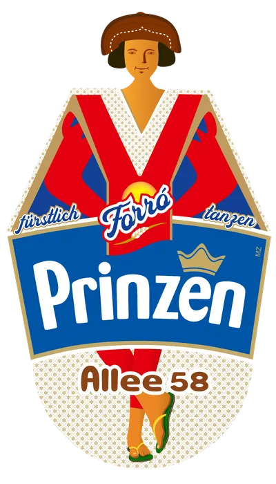
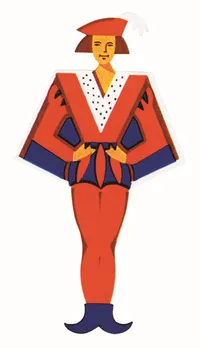
This is the guy that kicked the project of, but he fall out of favor for more elegant designs. I still hold him dear for giving me a challenge with many layers and detailed paths in Inkscape.

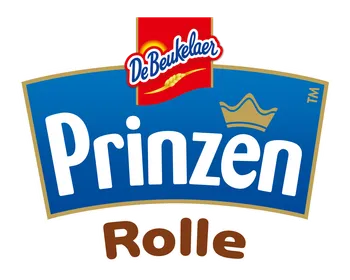
He is the prince of a well-known cookie brand, called Prinzenrolle. I gave him a traditional hat from the Northeast of Brazil and changed his boots for flip-flops, which instantly turned him into a Forró believer.

Chart detail Chart detail

This is an old and one-dimensional mascot, which made him easier to redraw but he also has more character than his predecessors. The banner he carries is a newer one from the same brand with insignia adapted to his new hobby.

The most important Inkscape skill for this were working with paths and these specific routines:

Path > Trace Bitmap
Path > Object to Path
Path > Simplify (Crtl+L)


Nick's tutorials were of great help as well.

Chart detail